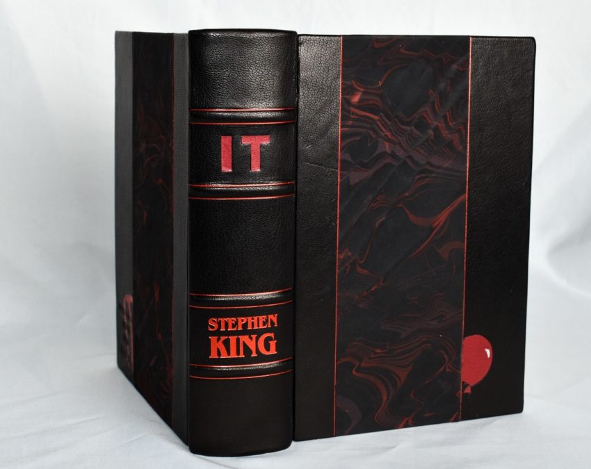
This is one of the more ambitious rebinds I’ve done to date. The book I worked from was a Viking first edition of Stephen King’s It. I hadn’t read it yet, and I definitely enjoyed delving into the fandom that surrounds the book and movies.


The Specs:
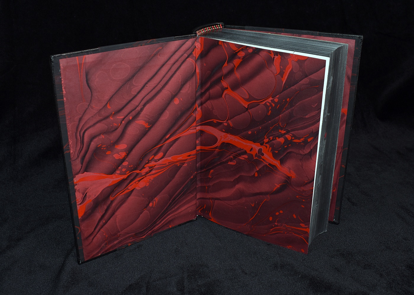
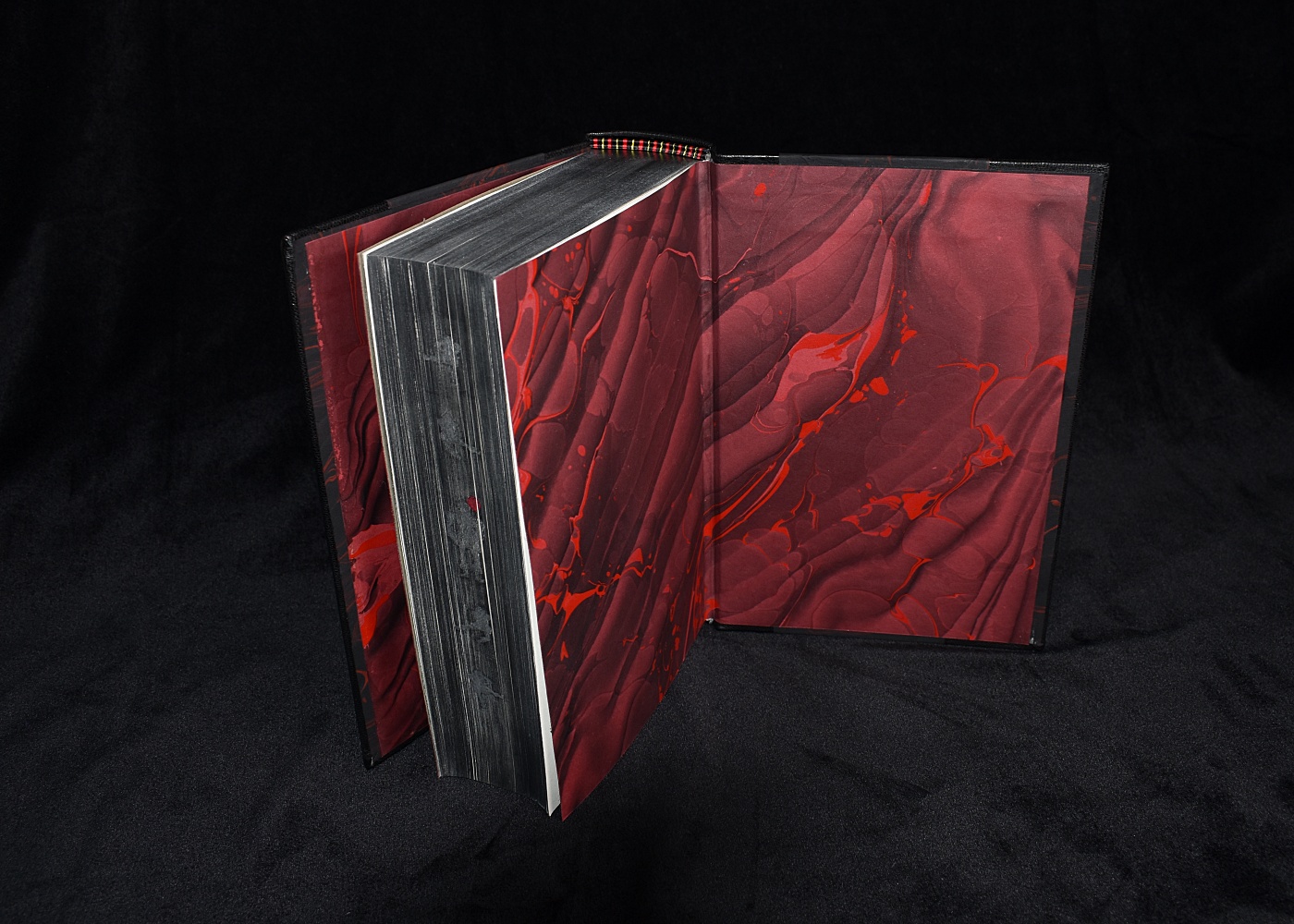
The spine was removed from the text block and re-bound with the double-fan method. Text edges are done in graphite, with genuine silver foil details on the fore edge. The endbands are done in the french double endband method. I searched for two-ply thread to make sure there would be maximum sheen. The leather is Harmatan goat skin #28 black. The marbled papers were done by me. The black paper is overmarbled on a Spanish Wave pattern on Hahnemuhle Ingres, using Golden Fluid acrylic paints. The endsheets are a Spanish Wave pattern on Colorplan paper in Scarlet. I applied a strip of the black marbled paper along the inner edges so when the book is closed you see a hint of the same paper on the front center.
The lower front corner has an onlay of red leather to create a balloon peaking out from the center paper. Blind debossing creates the balloon string, and a touch of silver foil on the balloon for the 3-D effect. The lower back corner on the case is a blind stamp of the words “Everything Down Here Floats” with the “IT” letters foiled on top.
The client had floated the idea of a painted edge my way. I’ve never done more than a simple one color edge, but I was game to do more. I did have a hard time finding something that fit the book, however. I didn’t want to go the route of painting a scene, but I also didn’t want something cartoonish. We settled on doing a bright yellow with a splash of blood.
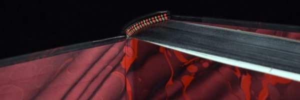
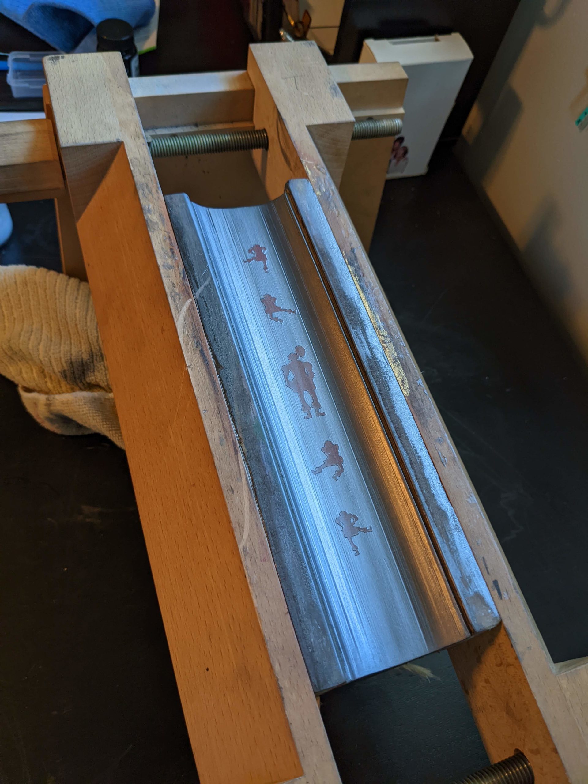
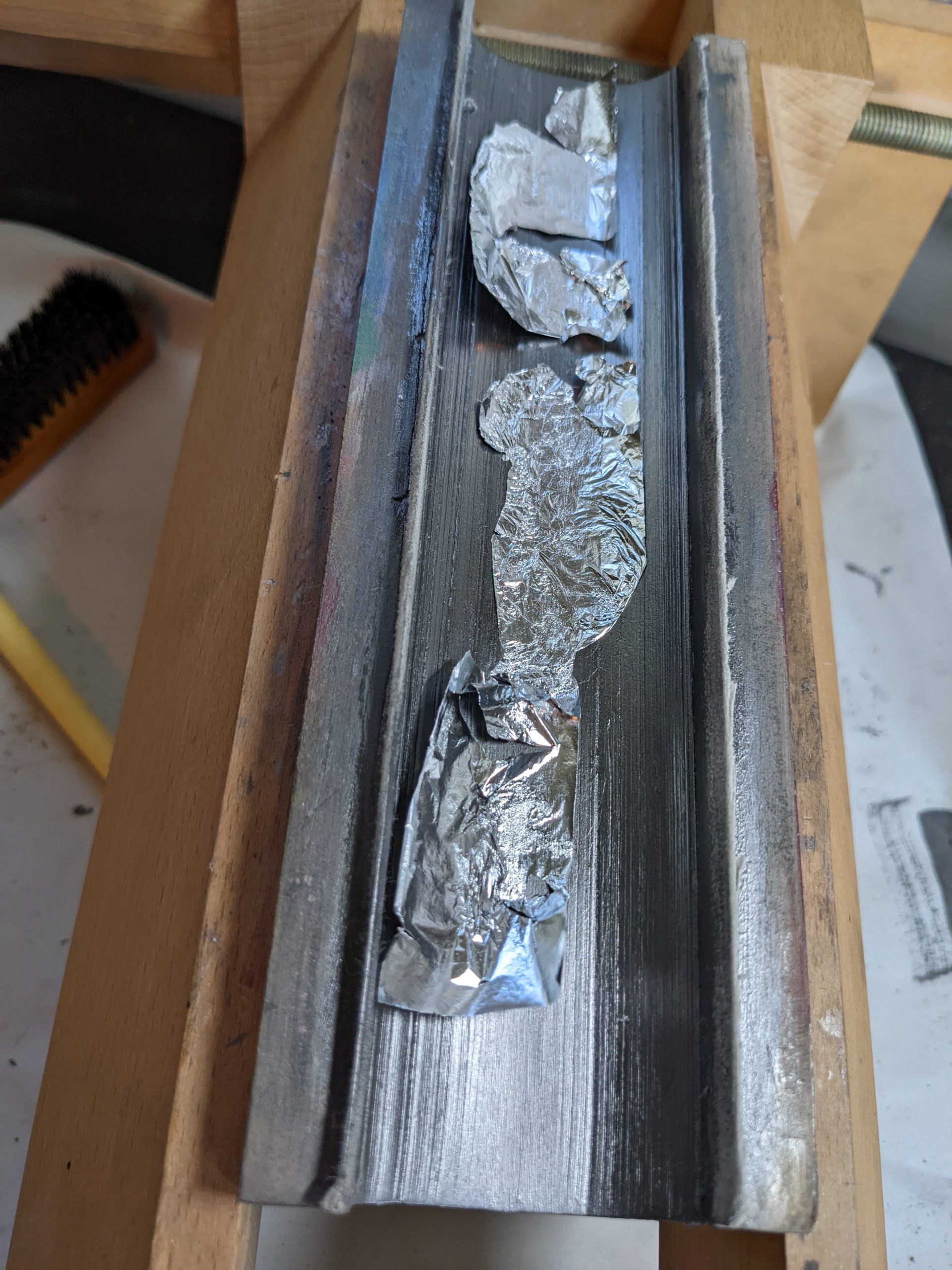
I still wasn’t happy with that concept. I kept putting off taking care of the edges until one night the right idea came to me. The client had mentioned something with dancing clowns, so why not do that in a silver foil? So I digitally created a few different silhouettes of Pennywise, and made stencils out of removable adhesives using my cricut. I wanted the rest of the edges to be a traditional graphite edge, so first I applied the clowns on the edge, and did a graphite application on the three edges. I used a coating of Renaissance wax to protect the graphite from wearing off, then applied the outline of the stencils, and removed the inside.


It was important to incorporate the phrase “Everything Down Here Floats” into this rebind. Since this is a nice soft goat leather, I only needed pressure to make a blind stamp. Using ITC Benguiat Gothic, I designed a stamp, and a friend used their glowforge to make it out of wood. I paid them in homemade Japanese Cream Pans, using the recipe from Cooking with Dog. After I moistened the leather, I used a clamp to hold the stamp down overnight. Taking a picture of the “IT” in the text that is drawn in blood in the bathtub scene, I made another stencil. I then used red foil and a woodburning iron with the flat attachment to color in the stencil.


I did two marbled patterns for this work. The black is on Hahnemuhle Ingres. I do love this paper, but I’m learning that this really needs freshly made alum that is slightly weaker than my usual amount, otherwise there can be a gray cast to the paper. I loved the effect here because some of the grays came through with the waves, but I have some gel gits in green that I did at the same time where it is not a plus. After I did the Spanish Wave, I made thin ribbons in red on the marbling size, and used gal-water to create lots of space for the first pattern to show through.
For the endsheets I wanted to look like I reversed the front pattern. Even though I created the same look, I used different types of paper and colors of paint to make it match, since the color of the base paper changes the final look immensely. I also didn’t need to do a double marble to fight against the black base. I selected parts of the sheets that showcased the intense ribbons of red naphthol across the center.


The Spine
I kept the spine simple. Despite the case being mostly black with few colors, there is still a lot for the eye to look at, and it is easy for a big book like this to look overdone. My first case had the spine hubs more evenly spaced, and luckily I messed up the foil lines because it made the book look off-balance.
For my second case, I re-spaced the hubs to have a longer middle, which framed the title and author name closer. I ordered a custom magnesium die for King’s name in the font that is associated with his classic horror novels( ITC Benguiat Gothic), figuring that I’ll reuse it enough times in the future to make the expense worth it.
The title is a leather onlay of red goat leather. I chose a sans-serif font to keep it simple compared to the author name. I also didn’t want it to look too similar to the mass market editions, what with the author font being the same.

Endbands
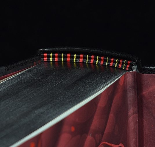
Is there anything better than silk endbands? I think not. I did these in black, red, and yellow. This is the only yellow you will find, but it adds the perfect pop against the graphite.
Case Front
I wanted just a pop of color, so using the same red leather for the title, I cut out a simple balloon that could peak out from the center paper. A touch of silver foil to make it look like a balloon instead of a random red circle. Using a bone folder, I created the impression for the balloon’s string.
